The way artwork is framed can completely change how it feels in a room. The image itself may stay the same, but the right frame can bring out colors, create contrast, add depth, and give the piece a more finished presence. Knowing how to choose a frame starts with looking at the artwork’s colors, subject, mood, and style, as well as the space where it will be displayed.
A good frame should support the artwork rather than compete with it. The art of framing is about finding that balance by using color, texture, proportion, and frame style to enhance the image while keeping the artwork as the main focus.
Framing can also provide additional support and protection from everyday handling, dust, and wear. Proper placement and care still matter, especially when it comes to direct sunlight, humidity, and moisture, but a well-made frame gives the artwork a more complete and secure presentation.
At Lumaprints, our framed canvas prints are available in floating, decorative, and traditional gallery frame styles, giving artists, photographers, businesses, and anyone decorating a space plenty of ways to match the finished piece to the artwork.
Standard Floating Frame Collection
Floating frames are a popular choice when you want the artwork to feel clean, modern, and gallery-ready without adding too much visual weight around it.
Unlike a traditional frame that sits close to the artwork, a floating frame leaves a small visual gap between the canvas and the surrounding frame. That separation creates the appearance that the canvas is suspended or “floating” inside the frame.
The effect is subtle, but it makes a noticeable difference. It adds depth and gives the edges of the canvas room to breathe while keeping the artwork at the center of attention.
Lumaprints offers different floating-frame finishes depending on the canvas depth selected.
Floating Frames for 0.75″ Canvas
The 0.75″ canvas profile works well when you want a slimmer presentation. Standard floating-frame finishes include Black, White, Silver, and Gold.
Black
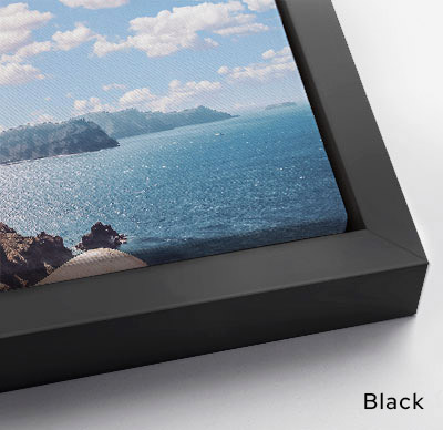
Black is one of the easiest frame colors to work with. It adds definition without drawing too much attention away from the artwork and pairs especially well with black-and-white photography, contemporary art, graphic designs, and pieces with strong contrast.
White
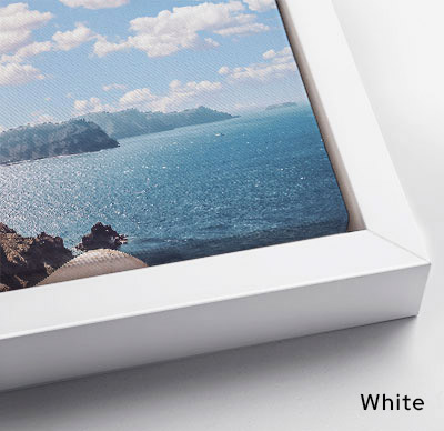
A white frame keeps the overall presentation light and understated. It works beautifully with pastel colors, minimalist artwork, soft photography, and interiors where you want the art to blend naturally into a bright space.
Silver
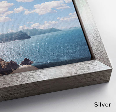
Silver brings a cooler, polished finish to the artwork. It can work particularly well with architectural photography, digital art, cool color palettes, and images that already contain gray, blue, or metallic tones.
Gold
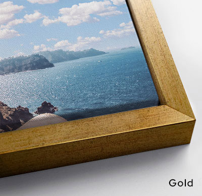
Gold brings warmth without necessarily making a piece feel overly traditional. Paired with the right artwork, it can highlight warm tones, rich colors, portraits, abstract pieces, or artwork that needs a slightly more elevated finish.
Floating Frames for 1.25″ Canvas
Warm and radiant, bringing a touch of luxury and classic beauty to your print.
Natural Oak
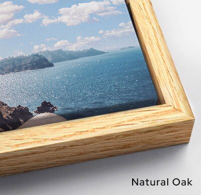
Natural Oak has a lighter, organic appearance that works naturally with landscapes, botanical artwork, family photography, neutral color palettes, and Scandinavian-inspired interiors. It adds warmth without feeling heavy.
Espresso
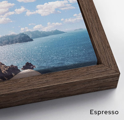
Espresso has a dark brown finish that adds richness without the sharper contrast of pure black. It pairs nicely with portraits, warm-toned photography, vintage-inspired images, and artwork with deep reds, browns, or earthy colors.
Maple
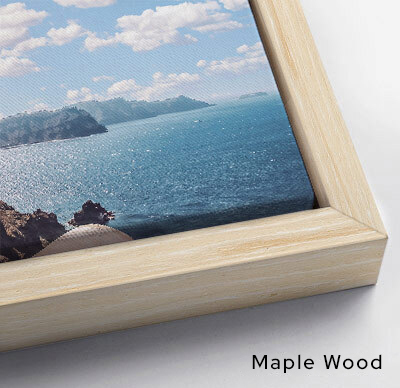
Maple offers a soft, natural wood appearance that feels simple and versatile. It works well with minimalist designs, illustrations, photography, and neutral interiors where you want the artwork to feel warm but uncluttered.
Natural Wood
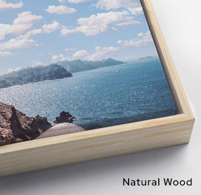
Natural Wood has an easygoing, earthy look that complements rustic, bohemian, coastal, and nature-inspired spaces. It is especially effective when you want the frame to feel like part of the room rather than a strong decorative statement.
While there is no single frame color that works for every image, floating frames are especially useful when you want to give artwork a finished appearance without surrounding it with an ornate profile.
Stylized Decorative Frame Collection
Sometimes the frame should have a little more personality.
Decorative frames add texture, color, detail, and character around the artwork. They can help a contemporary print feel more luxurious, give a portrait a traditional presence, or bring a rustic photograph closer to the style of the room where it will hang.
The key is choosing a decorative frame that supports the image instead of overpowering it.
Lumaprints’ decorative frame options are available with the 0.75″ canvas profile and framed fine art paper prints, and offer several very different looks.
Vintage Collection Copper
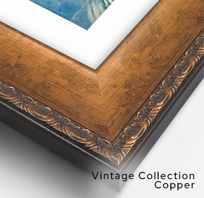
Warm and distinctive, Vintage Collection Copper works particularly well with classic portraits, heritage-inspired artwork, vintage photography, and pieces that already contain warm brown or copper tones.
Slimwoods Black Silver
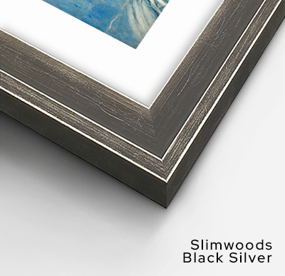
Slimwoods Black Silver combines a dark profile with a metallic accent. The result feels modern and refined, making it a strong option for photography, monochrome artwork, architectural images, and contemporary spaces.
Slimwoods Black Gold
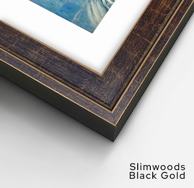
Black and gold create noticeable contrast without needing an oversized frame. This style works well with warm-toned photography, darker compositions, portraits, and artwork that could benefit from a subtle decorative detail.
Framer’s Choice Black with Gold
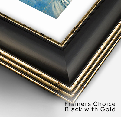
For artwork that calls for a more substantial frame, Framer’s Choice Black with Gold creates a stronger visual border around the piece. The gold detail softens the black exterior and can help connect the frame to warmer elements within the artwork.
Barnwood Driftwood White
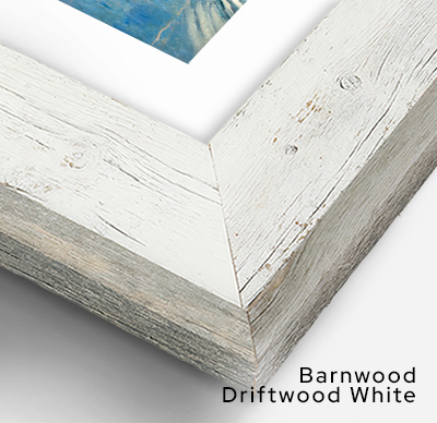
Barnwood Driftwood White has a lighter, weathered appearance that feels relaxed rather than formal. It is a natural fit for beach photography, landscapes, family photos, botanical art, and coastal-inspired interiors.
Barnwood Driftwood Gray
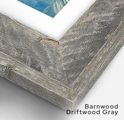
The gray version brings more contrast while maintaining the rustic character of the driftwood-style finish. It can work well with landscapes, black-and-white photography, modern farmhouse décor, and artwork with muted or neutral palettes.
Plein Air Economy Espresso Gold
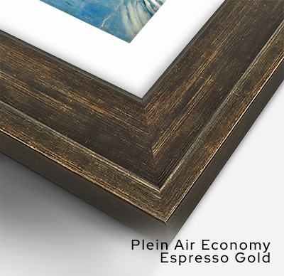
The combination of dark espresso and warm gold gives this frame a more traditional presence. It works particularly well with landscapes, still-life artwork, portraits, vintage-style prints, and images inspired by classical painting.
Gold Plein Air
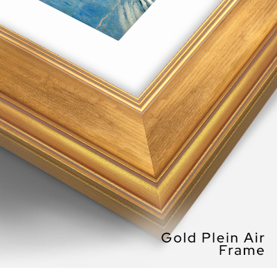
Plein Air Gold is one of the more expressive frame choices in the collection. It naturally suits classical artwork and traditional interiors, but it can also create an interesting contrast when paired with contemporary artwork.
Decorative frames are not limited to traditional art. Sometimes placing a clean modern image inside a more detailed frame creates exactly the contrast a room needs.
Traditional Gallery Frames
Floating frames create separation. Decorative frames add personality. Traditional gallery frames provide another option for artwork that benefits from a more familiar, classic presentation.
With this style, the canvas sits within the frame rather than appearing suspended inside it. This creates a more connected relationship between the image and its border.
Traditional gallery frames are particularly versatile. They can work with portraits, landscapes, fine art reproductions, photography, illustrations, and artwork intended for professional or more formal spaces.
Lumaprints offers traditional gallery frames in several profiles and finishes for the 0.75″ canvas option or framed fine art paper prints option, including variations in Black, White, Oak, Espresso, Gold, Maple, and Natural Wood.
A traditional gallery frame can be a good middle ground when a floating frame feels too contemporary but an ornate decorative frame feels too expressive.
Choosing the Right Frame for Your Artwork
Choosing a frame is partly about personal taste, but there are a few practical ways to narrow down the options.
- Start With the Artwork, Not the Room
It is tempting to choose a frame based entirely on furniture, wall color, or décor. Those things matter, but start with the artwork itself.
Look at its mood, subject, colors, and style.
A quiet landscape may pair naturally with oak or another wood finish. A bold abstract piece may benefit from a simple black floating frame. A traditional portrait might feel more complete with a decorative or gallery-style frame.
Once you have found a frame that supports the artwork, consider how the combination fits into the room. - Match the Mood
Different frame finishes can change the emotional tone of the same image.
Light woods and white frames tend to feel relaxed, airy, and contemporary. Black creates definition and contrast. Dark woods add warmth and weight. Metallic finishes such as silver and gold can introduce a more polished or decorative feel.
Rather than asking which frame is “best,” ask what kind of feeling you want the finished artwork to create. - Use Contrast Carefully
A frame doesn’t have to match the dominant color in the artwork.
In fact, a little contrast can help the image stand out.
A black frame around a bright photograph creates a clear visual boundary. A light wood frame can soften artwork with deeper colors. A gold detail may pick up a small warm tone within the image without matching everything else.
The goal is to create enough distinction that the artwork feels defined without making the frame the first thing people notice. - Pay Attention to Texture
Texture changes how formal or relaxed a framed piece feels.
A smooth black or white profile usually has a cleaner, more contemporary appearance. Natural wood grain introduces warmth and variation. Weathered finishes can make a piece feel casual and rustic, while detailed decorative profiles tend to feel more traditional.
This is especially important when the artwork will be displayed near furniture, flooring, shelving, or architectural finishes with their own strong textures. - Consider the Size of the Artwork
Frame scale matters too.
A detailed, wide decorative frame may look impressive around a larger piece but can overwhelm a very small image. On the other hand, a thin minimalist frame around a large statement piece may create exactly the clean presentation you want.
There is no universal rule, but the frame should feel proportionate to both the artwork and the space around it. - Think About Canvas Depth
Canvas depth can also influence the finished appearance.
A slimmer 0.75″ profile keeps the presentation relatively understated and gives you access to floating, decorative, and traditional gallery framing styles.
A 1.25″ canvas adds more depth while keeping the frame selection simple with Black, Natural Oak, and Walnut floating options.
A 1.50″ canvas creates a more substantial profile and works well for larger pieces or artwork intended to have a stronger visual presence on the wall. It also offers the broadest selection of standard floating-frame finishes.
Thinking about the frame and canvas depth together can help you create a more balanced finished piece.
How the Right Frame Changes the Way We See Art
One reason framing matters so much is that our eyes rarely experience artwork in isolation.
We see the image, the frame, the wall, the furniture, the lighting, and the surrounding room together.
A frame gives the eye a stopping point. It separates the artwork from everything around it and creates a deliberate visual boundary. That small change can make a familiar photograph feel more important or give a simple illustration a stronger presence.
Framing can also influence which colors and details we notice first.
Place a photograph in a black frame and its shadows may feel stronger. Surround the same photograph with Natural Oak and the warmer tones may become more noticeable. Add gold around a traditional painting and small warm highlights can suddenly feel more connected to the overall presentation.
The artwork has not changed. The way we experience it has.
That is why framing is more than a finishing accessory. It becomes part of the presentation itself.
Framing Artwork for Different Spaces
Where the artwork will be displayed can help guide the final decision.
For modern living rooms, offices, galleries, and studios, simple floating frames in Black, White, or natural wood tones often keep the space feeling clean.
Bedrooms and more relaxed interiors may benefit from softer finishes such as Maple, Natural Oak, White, or Natural Wood.
Rustic spaces can work beautifully with Barnwood styles, Espresso, Walnut, and other wood-focused finishes.
For formal dining rooms, traditional offices, hotels, or interiors with classic furniture, decorative or gallery frames can give artwork enough presence to feel connected to the space.
That doesn’t mean every frame in a room needs to match. A collected display can use different frame styles successfully when there is some shared element, such as similar wood tones, consistent artwork themes, or a limited color palette.
A Finishing Touch of Quality With Lumaprints
A thoughtfully chosen frame should make artwork feel finished without taking over the image.
Lumaprints offers solid wood frame options across modern floating styles, expressive decorative profiles, and traditional gallery frames, giving you room to choose the presentation that works best for your artwork.
The choice may be as simple as adding a clean black border around a photograph. It might mean pairing a landscape with Natural Oak or Walnut. Or it could mean giving a classical piece more character with a decorative gold or espresso profile.
What matters is that the frame feels intentional.
Takeaway: Let the Frame Support the Art
The best frame is not necessarily the one with the most detail or the boldest finish. It is the one that helps the artwork feel complete.
Start with the image. Look at its colors, subject, mood, and style. Then consider contrast, texture, canvas depth, frame profile, and the room where it will live.
A good frame creates separation without distraction. A great one can bring out something in the artwork that was already there but wasn’t quite as noticeable before.
Whether you prefer a simple floating frame, the warmth of natural wood, a traditional gallery profile, or something more decorative, framing gives you another way to shape how your artwork is experienced. The image remains the focus, while the frame quietly gives it the space, structure, and presence it deserves.
Ready to give your artwork a polished, gallery-ready finish? Explore Lumaprints’ framing options and choose a style that complements your artwork and the space where it will be displayed.