Introduction
A strong digital file is an important part of preparing artwork for printing, but not every artist has a professional camera. With the right lighting, camera settings, and physical setup, your smartphone can still capture detailed images of your artwork.
In our Webinar 66, “Why Taking Photos of Your Art Is Now Easier than Ever,” we walked through how to photograph artwork with a phone, using an iPhone SE and Samsung S26 as examples. We focused on small to medium-sized artwork, since extra-large designs can be more difficult to capture in detail. For larger pieces, we suggested checking whether a local library rents out cameras or working with a local photographer when needed.
How to Set Up Your Artwork for Photography
Before changing your phone settings, we recommend starting with the physical setup. Lighting, color accuracy, alignment, and camera stability all affect how clearly you capture the original artwork.
For indoor artwork photography, we recommend using at least two light sources, such as neutral overhead lighting and a light positioned to the side. This helps prevent harsh shadows while allowing texture, including acrylics and other raised details, to show through. Check that the light is not too warm or too cool. If the artwork looks overexposed, move the light farther away or dim it when possible.
For outdoor photography, we recommend mornings with softer light or light overcast conditions instead of harsh direct sunlight. We also suggest including gray cards with white, black, and 18% gray references in your capture. They can help you check exposure, white balance, and color temperature before and during editing.
We suggest placing your artwork against a wall rather than laying it flat on a table, which can introduce shadows. Keep your phone parallel to the artwork, turn on the camera grid and leveler if available, and consider using a tripod. A five- to ten-second countdown can reduce movement and give you time to step away so you do not cast a shadow. Take several photos to compare your results.
Camera Settings for Photographing Artwork With Your Phone
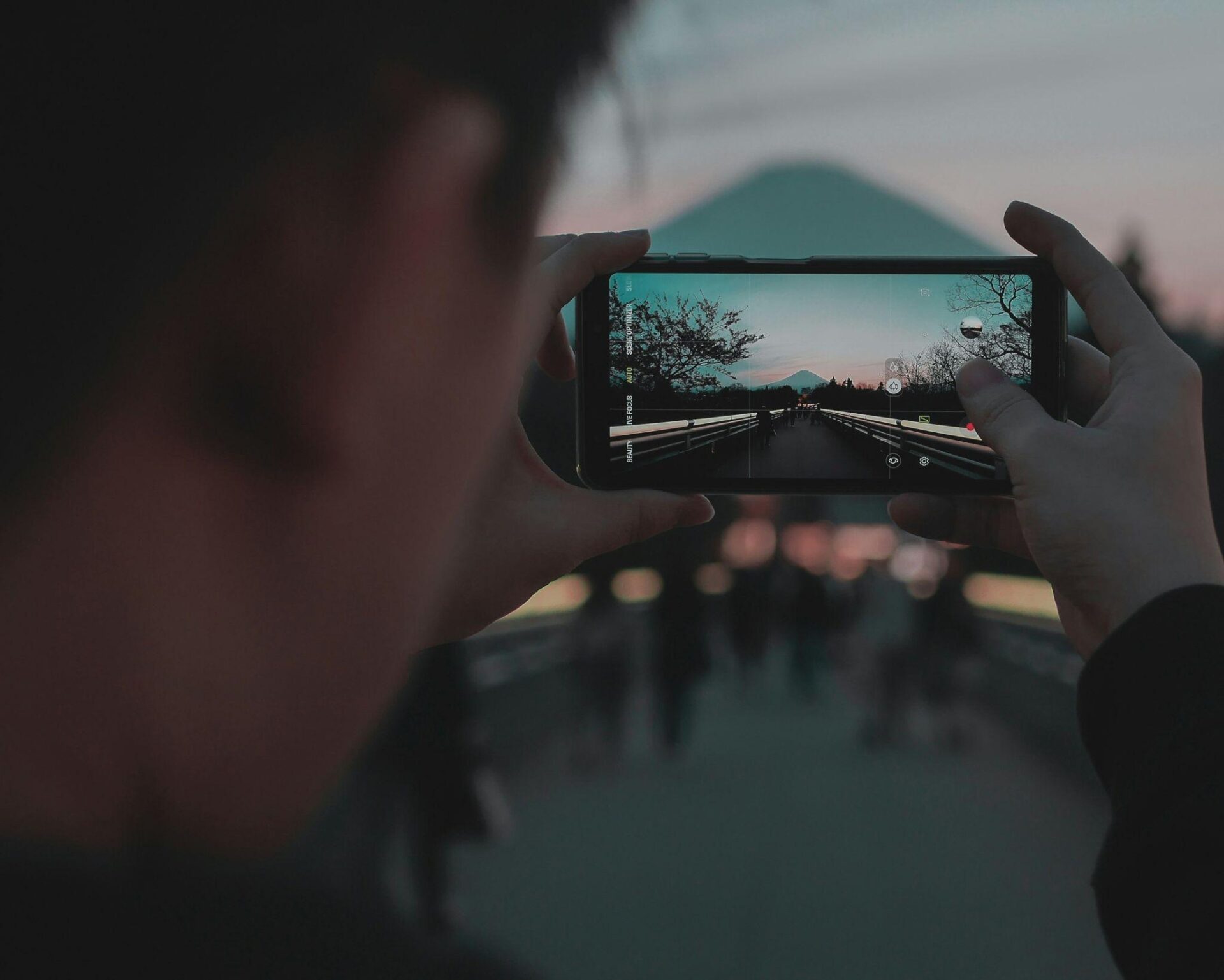
Phone menus differ by model, so we demonstrated general camera settings using an iPhone SE and Samsung S26. The goal is to make the image on your phone look as close as possible to the original artwork.
Here are the camera settings and checks we covered:
- Turn on the grid and leveler, if your phone has them, to help keep the artwork straight.
- Choose “Most Compatible” instead of “High Efficiency” when available, to save in JPEG and avoid unnecessary format conversion.
- Turn off automated color or contrast adjustments when those controls are available. We also turned off Smart HDR during the demonstration.
- Turn off Live Photo on iPhone, so you capture a still image.
- Use the timer, check exposure and brightness, and compare the image on your phone with the original before taking the photo.
There is no single setting that works for every phone. Even a high-resolution image can be blurry. After capturing your artwork, zoom in to check whether details remain crisp or pixelation becomes noticeable. We also discussed RAW capture on newer phones. If you are familiar with RAW files, you can try that setting; otherwise, a standard capture can work well.
How to Prepare Your Photo for Printing
Learning how to photograph artwork for printing does not end when you take the picture. We recommend opening the photo in an editing program and keeping your original artwork nearby. Compare the captured image with the original as you check color, highlights, shadows, and overall color temperature.
We recommend making small corrections rather than heavy edits. When adjusting brightness, contrast, or hue and saturation, start with increments of three to five points and compare the result before making more changes. If you need drastic adjustments, consider capturing the artwork again instead of losing important details through overediting.
Once the color and brightness look right, crop out unnecessary edges. If the artwork is slightly tilted, you can rotate the photo or use Edit > Transform > Distort in Photoshop to bring the edges into alignment. We demonstrated these adjustments using an artwork purchased from an antique store.
We also compared the original antique artwork with a finished print. In that example, we made a creative choice to show more of the original texture in the print. As you make your own adjustments, keep referring to the original instead of relying on the monitor alone. Check your monitor settings, turn off night mode, and reduce excessive screen brightness to make it easier to compare the display with a physical print.
Prepare Your Artwork for Print With Lumaprints
A strong print file starts with a strong capture. Before using your photo for an art print, we recommend checking the following:
- Color accuracy: Do the colors look like the original artwork?
- Important details: Are the details visible when you zoom in, without harsh pixelation?
- Texture: Does the capture show the textures and definition you want in the print?
- Brightness: Is the image bright enough for a print, rather than only for a backlit monitor?
We also recommend making a test print so you can compare the physical result with your original artwork. If the test print looks darker than expected, try a small brightness adjustment and compare again. For the recommended image resolutions and DPI at different print sizes, refer to the guidance on our website.
Frequently Asked Questions
During our live Q&A, we answered common questions about photographing artwork and preparing the images for printing.
- Why did my canvas print look darker than my original painting? – A monitor produces its own light, while a paper or canvas print does not. We recommend comparing your printed result with the original and considering a small brightness increase if the print looks too dark. A test print can help you judge the adjustment before printing again.
- How can I photograph three-dimensional or quilling paper art? – We recommend using two light sources and moving them until soft shadows reveal the peaks, valleys, and definition of the artwork without creating harsh shadows.
- How do I make artwork look rectangular without cropping too much? – We suggest using the grid and leveler during capture to minimize skewing. For a small remaining tilt, crop carefully and use Edit > Transform > Distort in Photoshop to adjust the edges.
- Can photography lights overexpose artwork? – Yes. We recommend positioning lights farther from the artwork or dimming them, if possible, and checking for overexposed areas.
- Is a high-resolution phone photo always ready for printing? – Not always. Even a high-resolution image can be blurry. Zoom in after capture to check sharpness and pixelation, and review the print-size and resolution guidance on our website.
Conclusion
You do not always need a professional camera to photograph small or medium-sized artwork. With neutral lighting, careful alignment, suitable phone settings, and a stable setup, you can capture a strong digital file for printing. That’s what we demonstrated in Webinar 66.
Keep comparing your photo with the original artwork, especially its color, brightness, definition, and texture. Make small post-editing adjustments when needed, and take another photo if those details are not coming through clearly. To revisit our demonstration and audience questions, watch Webinar 66 on our YouTube channel or visit our website for print-size and resolution guidance.