Color can change the way a room feels almost instantly. It can make a space feel warmer, calmer, brighter, more energetic, or more grounded depending on the shades you bring into it. With wall art, color becomes more than a decorative detail because the prints you choose can help shape the atmosphere of the room.
Understanding color psychology in interior design can make it easier to choose artwork with intention. Instead of selecting a print only because it matches the furniture, you can also think about the feeling you want the space to create. A bold abstract piece may bring energy into a living room, while a soft landscape can give a bedroom a quieter, more relaxed character.
Wall art also gives you an easy way to introduce color without repainting the room or changing your entire décor. Whether you prefer photography, illustrations, abstract artwork, or landscapes, the colors within the print can help bring the room together and give the space more personality.
The Psychology of Colors
Colors can create different visual impressions depending on their intensity, surrounding décor, lighting, and the artwork itself. While people may respond to colors differently, certain shades are commonly associated with particular moods and styles.
- Red: Bold, energetic, and attention-grabbing. Red works well in spaces where you want more visual energy, such as living rooms or dining areas.
Art Style / Prints: Abstract expressionism, modern art, pop art, city scenes, or warm landscapes. - Blue: Calm, cool, and visually soothing. Blue is often a natural choice for bedrooms, home offices, and spaces where you want the artwork to feel less intense.
Art Style / Prints: Seascapes, watercolor landscapes, minimalist abstracts, photography, or soft geometric designs. - Yellow: Bright, cheerful, and warm. Even a small amount of yellow can make neutral artwork feel more lively.
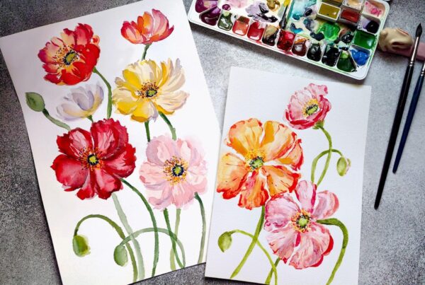
Art Style / Prints: Florals, sunny landscapes, still life, abstract artwork, or pop art. - Green: Fresh, balanced, and closely connected to nature. Green works especially well with interiors that use natural materials, wood tones, or botanical elements.
Art Style / Prints: Botanical illustrations, forests, garden photography, landscapes, or nature-inspired abstracts. - Purple: Expressive and versatile. Deep purple can bring richness and drama, while lavender and softer shades create a gentler look.
Art Style / Prints: Modern abstracts, celestial artwork, florals, or dreamlike landscapes. - Neutrals (Black, White, Gray, Beige): Simple and grounding. Neutral prints can give a room structure without competing with furniture or other decorative elements.
Art Style / Prints: Black-and-white photography, line art, architectural prints, minimalist designs, or soft abstract artwork.
Using color psychology in interior design does not mean following strict rules. It is more about understanding how different colors can support the atmosphere you already want to create.
How Colors Affect Mood in Different Spaces
Thinking about how colors affect mood becomes more useful when you connect the artwork to the purpose of the room. Each space serves a different function, so the wall art does not need to create the same type of visual energy everywhere.
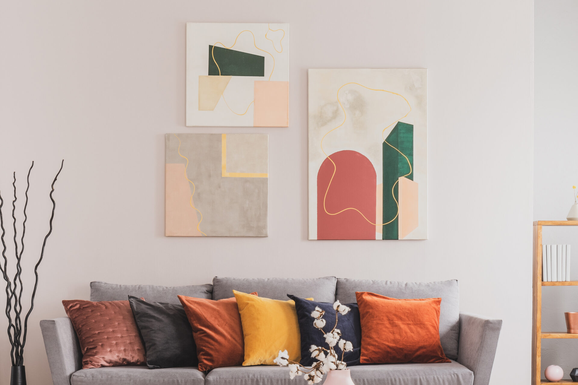
- Living Rooms: Warm reds, oranges, golds, and earthy tones can make the room feel more lively and inviting. Large abstracts, landscapes, or statement canvas prints can also create a strong focal point.
- Bedrooms: Soft blues, muted greens, beige, and lighter purples can give the room a quieter feel. Landscapes, botanical artwork, and soft photography are easy choices when you want the space to feel more relaxed.
- Home Offices: Blue and green can give the room a clean, focused look, while touches of yellow or orange can add warmth and personality. Geometric artwork, photography, and simple abstract prints work well here.
- Kitchens & Dining Areas: Green, yellow, terracotta, and warm neutral shades can create a fresh and welcoming atmosphere. Botanical prints, food photography, still life, and nature-inspired artwork are natural fits.
- Bathrooms & Meditation Spaces: Aqua, pale green, beige, gray, and soft blue can support a calmer visual environment. Minimalist artwork, ocean scenes, and botanical prints can help keep the space feeling uncluttered.
Matching the print to the function of the room helps the artwork feel intentional rather than simply filling an empty wall.
Think About Color Temperature
Another helpful way to choose wall art is to look at whether the print feels warm or cool overall.
Warm colors such as red, orange, yellow, terracotta, and brown can make a room feel more intimate and energetic. Cooler shades such as blue, green, violet, and gray often create a quieter or more open appearance.
You do not have to choose one direction exclusively. Some of the most balanced artwork combines warm and cool tones. A blue landscape with an orange sunset, for example, can bring both calm and warmth into the same composition.
Lighting also matters. Natural daylight, warm lamps, and cooler artificial lighting can all change how the colors in a print appear throughout the day.
Wall Art Frame Aesthetics
The frame can also affect how the colors in your artwork are perceived. It creates a visual boundary between the print and the wall, so the finish you choose can either add contrast or help the artwork blend more naturally into the room.
If you want a ready-to-display presentation, framed canvas prints give you several ways to pair the artwork with a frame that supports its color palette and style.
- Black Frames: Strong and modern, black frames work well with bold reds, deep blues, jewel tones, and high-contrast photography. They create a defined edge around the artwork.
- White Frames: Clean and subtle, white frames work naturally with pastels, light neutrals, coastal colors, and minimalist artwork. They help keep the presentation bright and understated.
- Silver Frames: Silver pairs well with cooler colors such as blue, purple, gray, and muted green. It can add a polished finish without becoming too visually heavy.
- Gold Frames: Gold brings warmth and works well with yellow, red, orange, earthy tones, landscapes, and more traditional compositions. It can also create an interesting contrast around contemporary artwork.
- Natural Wood Frames: Wood tones work especially well with landscapes, botanical prints, photography, and earthy palettes. They can add warmth and texture while keeping the artwork connected to the surrounding décor.
When choosing a frame, start with the artwork itself. Look at the colors, subject, and overall style before trying to match the frame directly to the furniture. For more guidance, see our article on how to choose a frame for your artwork.
Choose Color With the Whole Room in Mind
A print does not exist on its own once it is placed on the wall. Wall color, furniture, flooring, lighting, textiles, and nearby decorative pieces all influence how the artwork feels in the space.
If the room already contains several strong colors, a more neutral print may help create balance. If the room is mostly beige, white, gray, or another neutral shade, wall art can become an easy way to introduce a stronger accent.
Print size matters too. A small red detail may feel subtle in a smaller piece, while the same color across a large print can become one of the most noticeable elements in the room.
The goal is not to make every color match. A better approach is to look for a few visual connections between the artwork and the room so the final arrangement feels natural.
Bring the Right Mood to Your Walls
Wall art can do more than fill an empty space. The right colors can give a room warmth, create contrast, soften a neutral interior, or add the visual energy that was missing.
Start with the atmosphere you want the room to have, then consider the artwork’s dominant colors, size, frame, lighting, and surrounding décor. Most importantly, choose something you will enjoy seeing every day.
Ready to give your space more color and personality? Turn your favorite artwork, photography, or designs into professionally printed wall art with Lumaprints and create a display that feels right for your room.