Gen Z has grown up discovering photography through social media, short-form video, online portfolios, and image-heavy platforms. That has influenced how younger audiences encounter visual work, but getting attention online and creating something people actually want on their wall are still two different things.
In Webinar 61, we looked at Gen Z photography trends, the visual styles showing up across younger audiences, and what photographers can take from those trends without changing their entire creative identity.
The goal is not to chase every new aesthetic. It is to understand what catches attention, test what fits your work, and think about how an image moves from a screen into a physical print.
Here are the key takeaways from the session.
Why Gen Z Photography Trends Matter
Gen Z audiences spend a significant amount of time discovering photography through digital platforms, so visual styles that stand out quickly can naturally attract more attention.
Some of the styles often associated with younger audiences include:
- Cinematic color grading and stronger mood
- Bold contrast and neon-inspired color
- Highly detailed or immersive imagery
- Dreamy and surreal landscapes
- Nostalgic color palettes influenced by earlier decades
- Photography that feels personal rather than overly polished
These Gen Z photography trends are useful to watch, but they should be treated as creative signals rather than rules.
If your work is known for quiet landscapes or natural color, there is no reason to suddenly turn everything neon. Instead, experiment with a few images and see whether certain crops, color treatments, or presentation styles feel natural for your photography.
The strongest work still needs to look like yours.
What Captures Attention vs. What Sells
A photograph that performs well on Instagram or TikTok will not automatically become a successful print.
Online, people make decisions quickly. A dramatic crop, unusual angle, or strong color can stop someone from scrolling. Once that same photograph becomes wall art, the viewer spends much more time with it.
Before offering an image as a print, ask a different set of questions:
Would I want to look at this every day?
Does the composition still work at a larger size?
Would it fit naturally into a bedroom, office, living room, or creative space?
Small adjustments can sometimes help:
- Review the crop at the actual print ratio
- Test both portrait and landscape formats when the composition allows it
- Check whether strong saturation still feels comfortable at a larger scale
- Make sure important details are not too close to the edges
Instead of choosing your print catalog only from social engagement, use online response as one signal and then judge the artwork as a physical product.
Color and Medium Considerations
Color plays an important role in many current photography trends, but the final print medium can change the way those colors feel.
Muted pastels can create a softer, nostalgic look, while stronger contrast or brighter colors can give photography more visual energy.
The print format should support that character.
Canvas
Canvas prints can work well with cinematic images, landscapes, softer color palettes, and photography where a little surface texture adds warmth.
Metal
Metal can suit photography with stronger contrast, saturated color, architecture, night scenes, or images with a cleaner modern look.
Fine Art Paper
Fine art paper prints are a flexible option for photography where detail, subtle tonal changes, or a more traditional print presentation matter.
Do not assume one material is automatically better because it looks more premium.
Print the image in the format that suits the photograph.
Framing Can Change the Way the Image Feels
Framing is more than an add-on.
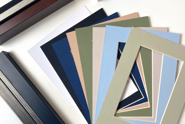
A frame can change how the photograph relates to the room around it. Natural wood may soften a landscape or warmer image, while black framing can give a photograph stronger contrast and a more contemporary edge.
For photographers selling online, room mockups can also make a big difference.
A customer may understand that a print is 24×36 inches, but seeing that size above a sofa or desk makes the scale much easier to picture.
If you are offering framed photography, show it that way in at least some of your product images rather than expecting buyers to imagine the finished result themselves.
Creating Collections and Limited Editions
Individual photographs can sell on their own, but a collection gives the buyer more context.
You might group work by:
- Location
- Color palette
- Subject
- Mood
- Travel series
- Architectural style
- Season
Two or three related photographs can also work as a diptych or triptych when the compositions naturally belong together.
Limited editions are another option, particularly for photographers who want certain pieces to feel more collectible.
If you use limited editions, keep the offer clear. State the number available and maintain accurate records rather than using scarcity simply as a marketing tactic.
A limited release works best when the artwork itself feels special enough to justify it.
Engaging Gen Z Beyond Photography
Younger audiences often discover the photographer before they become interested in buying a print.
That gives storytelling a useful role.
Instead of posting the finished photograph every time, occasionally show what happened around it.
Where were you?
What made you stop and take the photograph?
What did the scene look like before editing?
Why did you choose that crop or color treatment?
Short videos, voiceovers, editing clips, location footage, and photographs of the finished print can give the image more context without turning every post into an advertisement.
The objective is not to manufacture a story around every picture. Share the details that are actually worth telling.
Take Online Interest Into the Physical World
One useful way to think about social media is as a testing ground.
If several images receive unusually strong saves, shares, comments, or repeat interest, look at whether those photographs could work together as a physical collection.
Then test before expanding.
Order a sample, check the color and crop, photograph it in a real space, and see how people respond when the image is presented as something they can actually own.
The move from feed-worthy to frame-worthy usually happens when the photograph still feels interesting after the scrolling stops.
Workflow Tips for Artists
Experimenting with new visual styles does not mean rebuilding your entire workflow.
Start with a small group of images.
Try a different color grade, crop, or presentation and compare it with your normal work. When preparing several related photographs, batch processing can also save time while keeping the overall look consistent.
Before selling, review the files at the sizes you plan to offer.
A photograph that looks excellent on a phone screen can reveal softness, noise, or over-editing when enlarged.
For images with stronger colors, test prints can be especially useful because screens and physical materials do not reproduce color in exactly the same way.
Q&A Highlight: Marketing Ocean Art to Gen Z
One webinar question focused on marketing ocean photography, including sunrises and sunsets, to younger buyers.
The discussion highlighted a few useful approaches:
- Build the image around mood rather than treating it like a generic travel photograph
- Experiment with softer pastels, dramatic light, or stronger contrast when it suits the original image
- Look for compositions that feel different from common stock photography
- Use storytelling to explain where or how the photograph was created
- Show how the finished piece looks in an actual interior
Ocean photography is already a crowded category, so the photographer’s perspective matters.
The goal is not simply to photograph another sunset. It is to give the viewer a reason to remember yours.
Turn Attention Into Artwork People Want to Keep
Following a trend may help a photograph get noticed, but that alone is not enough to build a print collection.
Use trends as inspiration. Experiment with color, composition, storytelling, and presentation, but keep the parts of your photography that make the work recognizable as your own.
Then think beyond the feed.
Look at which photographs people continue returning to, test them as physical prints, and present them in a way that helps buyers imagine living with the artwork rather than simply liking it for a few seconds.
Ready to take your photography from screen to wall? Choose a small group of images that already connect with your audience, test the print formats that suit them best, and use Lumaprints to turn those photographs into finished pieces people can enjoy long after the scroll is over.