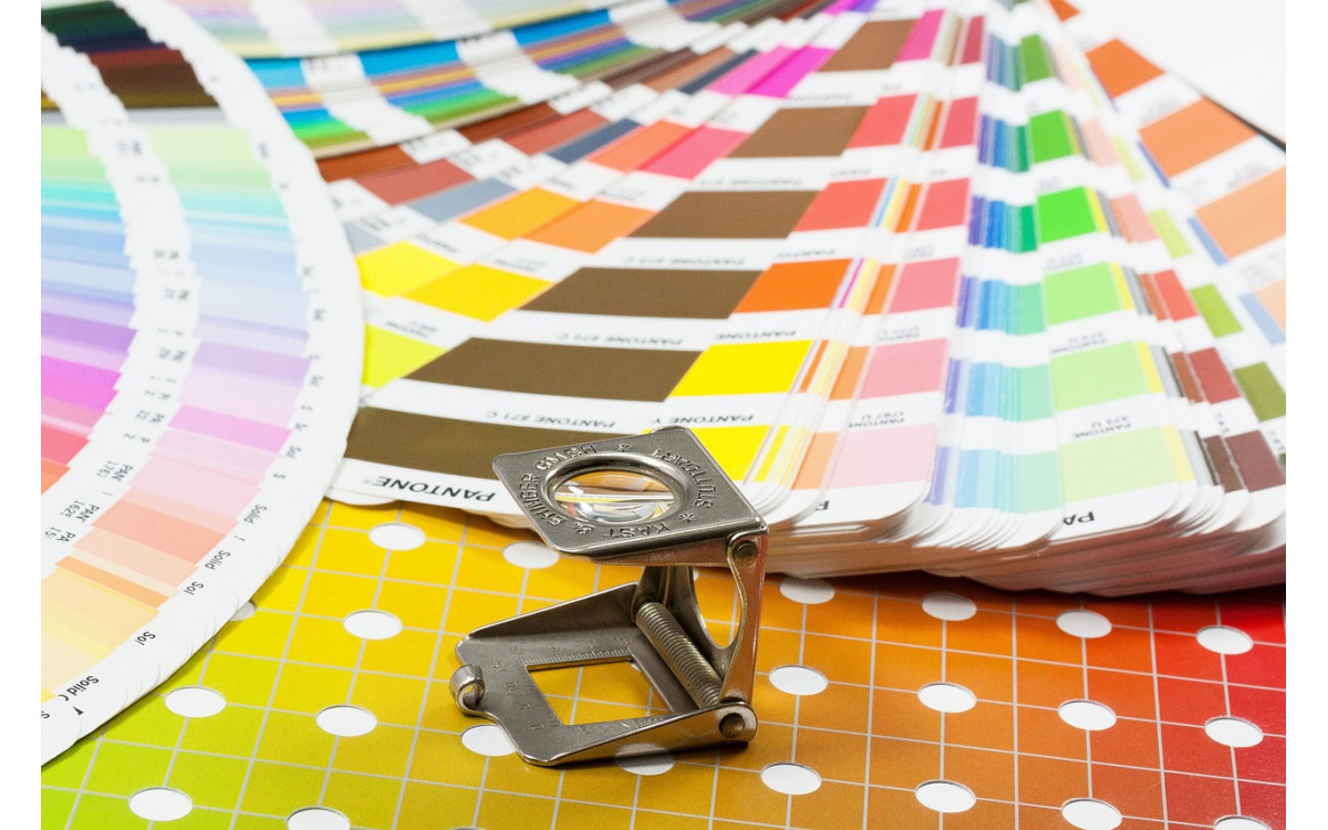
Soft proofing is a technique that allows you to see how a proof will look like when you send it to print, based on the color profile of the printer.
This helps save time and money, compared to making print after print to see how the colors will match up.
Basically, there are TWO ways to use soft proofing. First is to soft proof the color, which is what you see when the on-screen display options are off. Second is soft proofing the Dynamic Range or the contrast range.
Most printers will only give you about a 200:1 contrast range, where even a laptop display can provide around 400:1 contrast range.
The KEY to making soft proofing work is to setup the environment and have an understanding of how soft proofing is intended and designed to look.
How to do Soft Proofing
To start, you will want to go to your “view” tab and select proof setup. Depending on the type of print you want, select the appropriate option. For example, you selected customize, in the “customize proof condition” dialogue box that opens.
Choose the settings for the print that you want, Device to simulate, Rendering intent, Black point compensation, and On-screen display.
Activating the on-screen display, might make your image look not as good, but it will give you a more accurate representation of what the print will look like.
NOTE: Turning off your on-screen display option or not selecting paper color and black ink in the options, will only soft proof the way colors will reproduce, and not the dynamic range.
The Rendering Intent setting is basically a method of dealing with out of gamut colors.
If color and the relationship of a color to other colors is the most important aesthetic in an image, generally speaking, you will want to use the “Perceptual” rendering intent.
Use this if you wish to maintain the color aesthetics and it is the most important.
If the tone or the relationship between light and dark is the most important aesthetic for you, then the “Relative Colorimetric” setting will be good.
The only way to know which rendering intent option will produce optimal results on an image to image basis is to Soft Proof.
Once you have saved all of your settings, you can apply it to an action and call it up anytime.
When working on your images, you will almost always have to do some adjustments in curves and also the saturation, to get the image that you want.
A good way to work on your image is to create a duplicate of the image in another window and situate the two side by side or top and bottom.
By doing this, you can make adjustments to the image from what it will actually look like in print to what you would like it to look like.
If you want a good idea of what your image will ultimately look like on print, then select the on-screen display option.
Also, when you are looking at your image display, any white areas on the screen (e.g. photoshop interface) can and most likely will influence your perception of the image.
Your eyes will adapt to the white areas, this is called simultaneous contrast. A color will be perceived differently depending upon the surrounding colors.
It can affect detail, and shades, as well as color.
Although it is impossible to make your display and the print absolutely identical, it is still an accurate enough representation to produce good quality prints.
Soft proofing is all about control over what the image will look like, ink on paper.