
Introduction
If a customer says “the print looks different than my screen,” they most likely have a color management problem, even if they don’t know the term. Each device speaks color differently, which often leads to surprises, flat colors or prints looking much darker than expected when translated into physical materials.
We at Lumaprints hope to educate and shed some light on the importance of color management in printing to set up your digital print files for the best possible results. We’ll cover everything you need to know about color spaces, handling profile mismatch warnings, and setting up editing software like Photoshop, GIMP and Affinity for accurate repeatable output.
What is Color Space?
If we zoom into a digital image far enough, we see that it is made up of individual pixels. Each pixel contains numerical values that define its color. A color space tells your software how to interpret those numbers. The same numerical values can represent very different colors depending on which color space is assigned.
For example, the color value (0, 255, 0) represents the most saturated green possible within a given color space. Because Adobe RGB is larger than sRGB, that same value appears more vibrant in Adobe RGB than it does in sRGB (see Fig 1).

Fig 1. Difference in green under Adobe RGB color space vs. sRGB color space.
Each color space defines a specific range of colors that can be represented. Some color spaces are small and conservative, while others are much larger and capable of storing more color information. Below is a plot of what the color range is for each of the common color spaces:( see Fig 2, courtesy of Wikipedia)

Fig 2, Color range for each common color spaces
Common Color Spaces Used in Digital Printing
sRGB (black dashed triangle)
- A standardized color space designed to match most consumer displays.
- Advantages:
- Universally supported
- Consistent appearance across most screens and web browsers
- Low risk of unexpected color shifts
- Disadvantages:
- Limited color range
- Cannot represent very saturated greens, blues, and reds
- Leaves potential printable colors unused
- Best use cases:
- Web images, online previews, casual photography, and situations where maximum compatibility is required
Adobe RGB (1998) (orange dashed line)
- A wider color space designed for professional photography and printing.
- Advantages:
- Larger color range than sRGB
- Better representation of greens and cyans
- Excellent balance between quality and compatibility
- Disadvantages:
- Can appear dull on non–color-managed displays
- Requires proper color management to avoid shifts
- Best use cases:
- Professional photography, fine art printing, and files prepared specifically for print
ProPhoto RGB (dark purple line)
- An extremely large color space that includes colors beyond what monitors and printers can reproduce.
- Advantages:
- Preserves maximum color information
- Ideal for advanced editing workflows
- Prevents clipping during heavy adjustments
- Disadvantages:
- Easy to introduce errors if not handled correctly
- Requires 16-bit files
- Not suitable for final print delivery files
- Best use cases:
- Editing master files in Lightroom or Photoshop prior to conversion to a print-ready color space
CMYK (light purple line)
- A print-specific color model based on cyan, magenta, yellow, and black inks.
- Advantages:
- Matches how ink is applied in offset printing
- Predictable for commercial press workflows
- Disadvantages:
- Smaller color range than RGB
- Many vibrant colors cannot be reproduced
- Best use cases:
- Offset printing, magazines, packaging, and workflows where a specific CMYK profile is provided
Although ProPhotoRGB gives a very wide range of colors, we do not recommend sending print files with that color space. The images need to be transferred as 16 bit TIFF files which can make transferring and saving the files very cumbersome. Additionally, the printers can not physically achieve a majority of the colors in ProPhotoRGB, so the potential benefits of using this color space is grossly outmatched by the downsides. Advanced users can keep a master version of their file as ProPhotoRGB and make their edits in this format, before converting it to adobeRGB and sending it off to print.
We recommend you send your print files to us in adobeRGB for the reasons outlined above. However, if your file is already saved as sRGB, it is fine to send it to us in that format as well. The critical thing to verify is that there is a color space embedded in the file.
If we receive print files that do not have an embedded color space, then it will be very unpredictable how the colors will be outputted since there is no clear direction on how the numerical coordinates of the pixels should be mapped to a specific color. The image may print out overly saturated or extremely flat or anything in between. It will also print very inconsistently across different devices.
How to Set Up the Right Color Space on Photoshop for Printing?
To make sure a file has an embedded color space, please use photoshop with the following boxes checked in the color settings (see Fig 3):
Color Settings CTRL-SHFT-K on PC
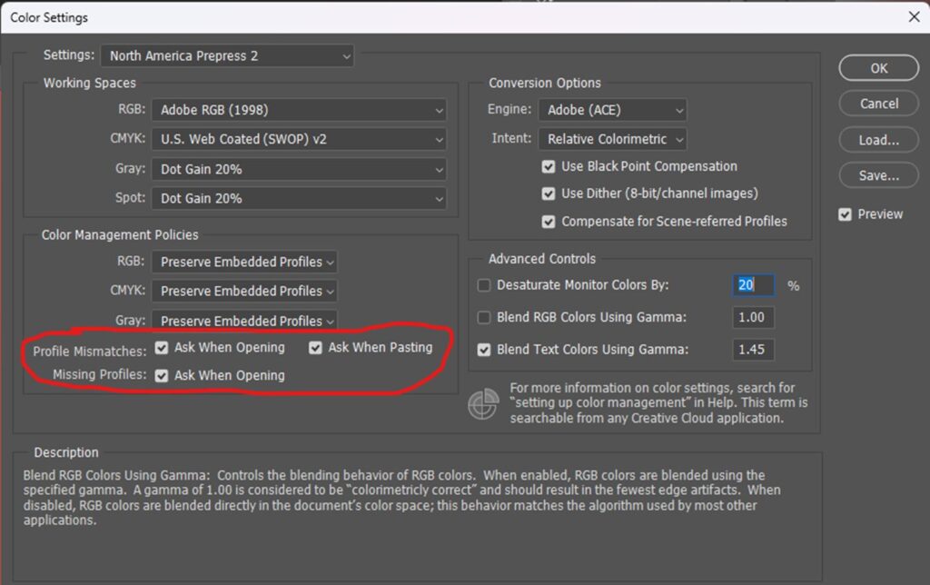
Fig 3. Color Settings on Photoshop
Photoshop will give you a warning when it opens a file without a color space, or if there are any mismatches to the color space that you set as default.
What to Do with Profile Mismatch Warning on Photoshop
A “Profile Mismatch” in photoshop occurs when the image you are opening has a different embedded color space than the one you have selected as the default.
If you have your default RGB mode as Adobe RGB, and you open an image file with an embedded color space of sRGB, you will get the following warning because it detects a mismatch (see Fig 4):

Fig 4. Embedded Profile Mismatch Warning
Selecting any of the first two options will not change how the colors appear. DO NOT SELECT THE THIRD OPTION: “Discard the embedded profile (don’t color manage)”
The reason why there is no change in color appearance when converting an image with the sRGB color space to adobeRGB color space is because the adobeRGB color space is larger than sRGB, and all the colors in sRGB can be represented in adobeRGB.
However, If it was the other way around, and the default RGB working space was set to sRGB, and you convert an adobeRGB image to sRGB, the colors in the image that is outside of the sRGB range will have to be shifted into what is possible with the sRGB color space.
If you select the first option (use embedded profile), Photoshop will respect that choice and not make any shifts to the color and allow you to use a different color space even though it is not the standard one that you had set. When you go to save later, it will also remember your choice and save the file in the original embedded color space.
It is also very important that the “Missing Profiles – Ask When Opening” is checked (refer to Fig 3, circled in red). This will have Photoshop warn you when it opens an image for editing and it detects that there is no color space embedded. If you have an older file that was created before these color settings were set, it is possible that the file was saved without embedding a color space. Additionally other programs can sometimes strip the color space without notifications. If you are using an image editor other than Photoshop, please make sure to research how to ensure a color space is embedded correctly.
What to Do with Missing Profile Warning on Photoshop
When a file is opened by photoshop, and the “Missing Profiles – Ask When Opening” is checked you will see the following prompt if the file to be opened does not have an embedded color space:
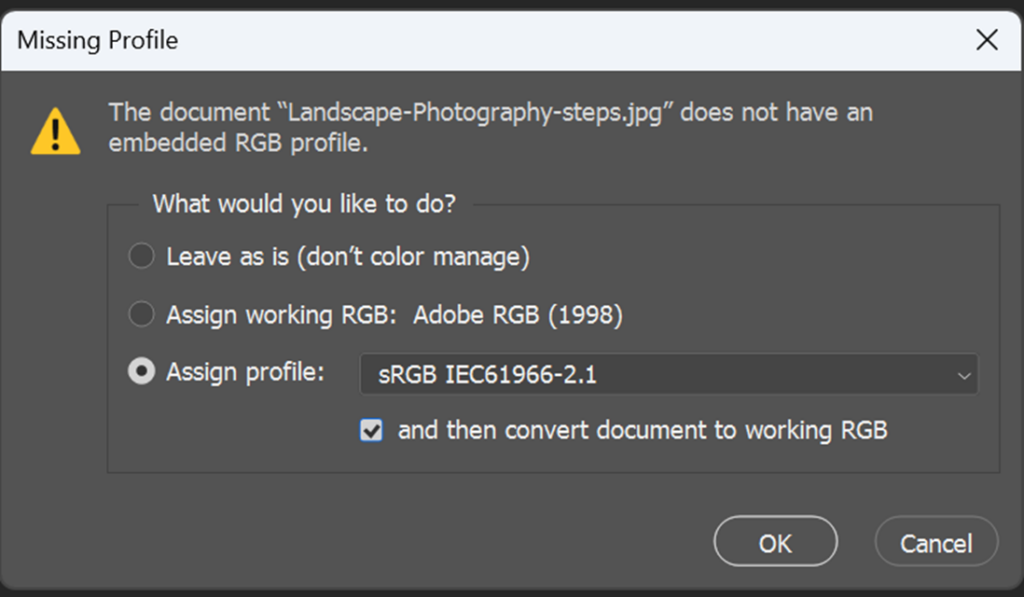
Fig 5. Missing Profile Warning
DO NOT SELECT the first option “Leave as is (don’t color manage)” since it will lead to unpredictable output.
The second option of “Assign working RGB” can potentially be dangerous. If the original file was created and edited in adobeRGB, then there should be no problems. However, if the original was created and edited in sRGB before the color space was stripped, then assigning it adobeRGB would oversaturate the image. Oversaturating may make an image more vibrant, but will give unnatural orange or red skin tones if there are people in the image. Since a large majority of image editing software and cameras default to sRGB, it is probably safer to assign sRGB if you open an image and it does not have any embedded color space. There is a checkbox in the third option to convert to the working color space afterwards.
If you are not sure what the original color space was, it is safer to select, assign sRGB, and then convert to adobeRGB. That way the colors won’t be oversaturated, but the image will be saved with the preferred adobeRGB color space.
Whenever you get a Missing Profile or Embedded Profile Mismatch, It is always good practice to view the image carefully on a calibrated screen with soft proofing activated to verify that there haven’t been any unexpected color changes to your image.
To make sure a color space is embedded into the image, it is critical that this checkbox is selected when saving the image (see Fig 6). Make sure you use “Save As” <CTRL-SHFT-S on PC> rather than regular “Save” <CTRL-S> otherwise you may not see this option.

Fig 6. ICC Profile Checkbox when Saving Image
Free Programs to Help Set Up the Right Color Space for Printing
We understand that not everyone has access to Photoshop. We discovered two free image editing programs, Gimp and Affinity, that could help you ensure you have the right color profiles on your digital image files for printing. Below is a guide for both.
How to Use Gimp to Set Up the Right Color Space for Printing
- Available for Mac OS, Windows, Linux
- Download Link: GIMP Free Image Editor Download
- Free to use, no subscriptions
- Download and install; no need to make an account
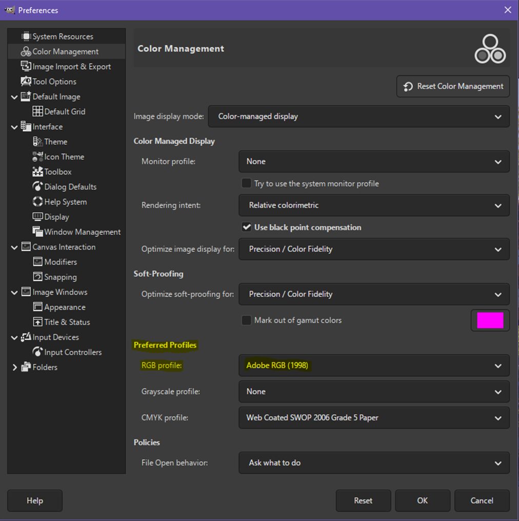
Step 1. Add Adobe (RGB) Color Profile into GIMP:
- Download the Adobe RGB (1998) ICC profile at the bottom link here: Adobe RGB Color Space Overview (Adobe)
- On GIMP, Go to Edit > Preferences > Color Management > Preferred Profiles > RGB Profile: “Select color profile from disk…” > Select downloaded Adobe RGB (1998)
Step 2. Convert Color Profile to Adobe RGB:
If a file doesn’t have an embedded profile, GIMP will automatically assign it with its default sRGB profile, then you can follow the steps for converting to Adobe RGB. If the file already has an embedded profile, then GIMP will respect it and you can proceed with the steps to convert it to Adobe RGB.
- Image > Color Management > Convert to Color Profile
- Dropdown menu > Select Adobe RGB (1998)
- Follow the information on below > Click “Convert”
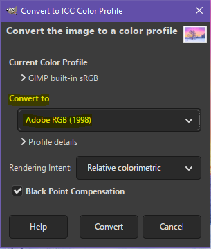
- Reference: GIMP Color Profile Conversion Documentation
How to Use Affinity to Set Up the Right Color Space for Printing
- Available for Mac OS, Windows, iOS (iPad) soon
- Download link: Affinity Photo Editor Download
- Free to use, no subscriptions* (*Requires a Canva account)
- Can customize which programs to add in the tabs for easy access
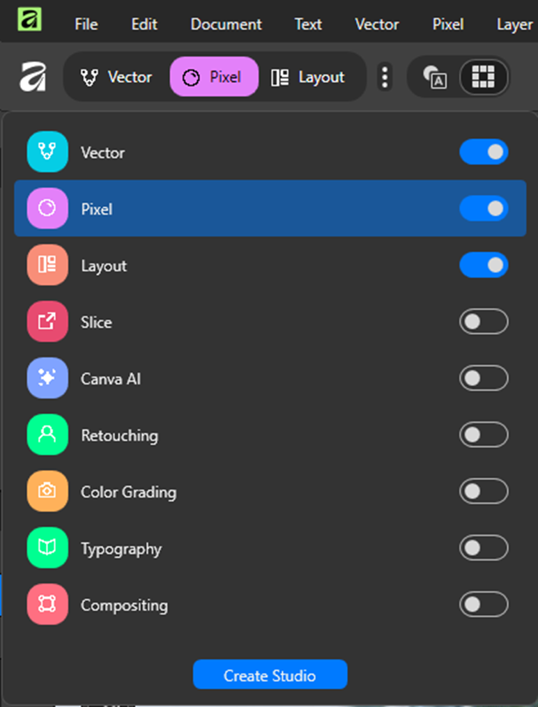
- Vector: For graphic design and vector
- Pixel: For correcting and enhancing images, digital art, and painting
- Layout: For publishing and structure-based layout
- Slice: For one bulk export operation of created drawn or layer-derived slices
- Canva AI: Generative AI and machine-learning tools (needs Canva paid subscription*)
- Retouching: Quick access to various retouching tools, brush tools, and selection tools
- Color Grading: Quick access to color-grading tools
- Typography: Quick access to advanced text features and tools
- Compositing: Quick access to non-destructive filters and basics to mixed media workflows
For the purpose of this exercise, you can just have the three toggled above.
Step 1. Set Up Adobe (RGB) as your Color Profile on Affinity:
- Go to Edit > Settings > Color > Choose “Adobe RGB (1998)” in dropdown menu for RGB Color Profile and make sure the settings are as shown below

Reference: Affinity Color Profiles Help Guide
Step 2. Convert Color Profile to Adobe RGB:
If a file doesn’t have an embedded profile, Affinity will automatically assign it with its default sRGB profile, then you can follow the steps for converting to Adobe RGB. If the file already has an embedded profile, then Affinity will respect it and you can proceed with the steps to convert it to Adobe RGB.
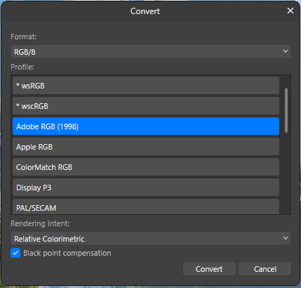
- Document > Setup > Convert Format/ ICC Profile… > Choose “RGB/8” for Format > Choose “Adobe RGB (1998)” for Profile > Choose “Relative Colorimetric” for Rendering Intent > Check “Black point compensation box”, if needed > Click “Convert”
Key Points to Set Up your Digital Print Files on Photoshop for Best Printing:
- Make sure your image has an embedded RGB color space. AdobeRGB is preferred, but sRGB will also work.
- Make sure the settings in Photoshop are selected to make sure any files opened without an embedded color space triggers a warning.
- After editing in Photoshop is completed, make sure the file is saved with the embedded color space information.
Frequently Asked Questions
Why does my print look darker than what I see on my screen? – Most monitors are too bright (uncalibrated) and unmanaged color workflows don’t translate properly to physical print inks.
Which color space should I send my files in? – We suggest you submit your files in Adobe RGB (1998), but sRGB is also acceptable, providing the profile is embedded.
What happens if I submit a file without an embedded color profile? – No embedded profile = unpredictable output. Colors can print flat, too saturated or change completely on different printers.
Should I convert my files to CMYK before sending them to Lumaprints? – No, we recommend that you send your digital files in an RGB color space (Adobe RGB preferred), as our modern printing systems work in wide-gamut RGB workflows.
What should I do if Photoshop gives me a “Profile Mismatch” warning? – Select “Use the embedded profile” or convert the document’s colors to your working space so long as you have defined your space as Adobe RGB. Never select “Discard the embedded profile”.
Conclusion
Knowing color management is the best thing you can do to avoid surprises in your print, and to make sure your physical products match what you see on screen. By learning about color spaces and setting up your editing software to embed color profiles, you create a consistent base for professional outcomes.
Get started by uploading your files or contacting the Lumaprints support team today.


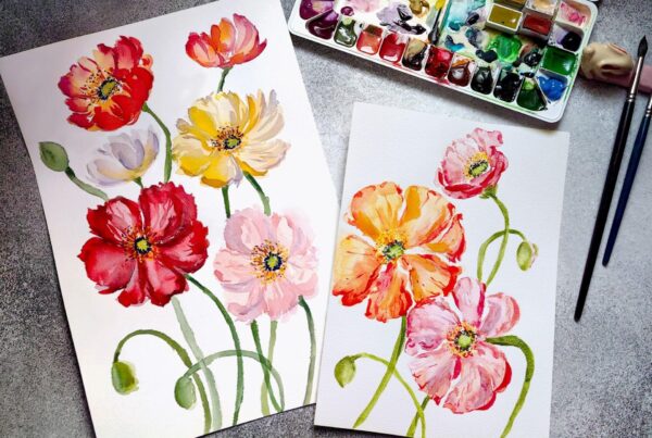

This has been SO INFORMATIVE, thank you! I’m a children’s book illustrator and usually the publisher scans the work but this time around I’m working in both watercolour and digital so I’m scanning pieces myself and running into mismatch problems. I think my Epson is scanning in s-RGB so I don’t want to covert to Adobe RGB in Photoshop. But will s-RGB be ok for book printing? I’ll be converting to CMYK so I’m wondering if I’m going to lose EVEN MORE information and if I should re-scan everything. Which will be a HIGE job.
Thank you so much!
Hi Therese, it’s entirely up to your book printer.
AdobeRGB matters more for wide-gamut printing like fine art and wall art printing, which is why we require it. It would cover all the sRGB color range just fine.
That said, as you can see from the graphics we shared, you’ll see that sRGB is fairly close with CMYK’s color range, but there may be chances of losing some color (as some parts of sRGB falls outside the CMYK space). That said if your files are already in sRGB and your book printer usually converts to CMYK, I’d recommend soft-proofing a couple files (not all!) with your printer’s CMYK profile in Photoshop to see whether any important watercolor colors are actually shifting noticeably between the two profiles.
If the artwork still looks good between the two, then there’s a very good chance your scans are completely fine for book printing. We always recommend doing a proof in cases like this when you’re unsure of the actual output 🙂
Hope this was helpful!