
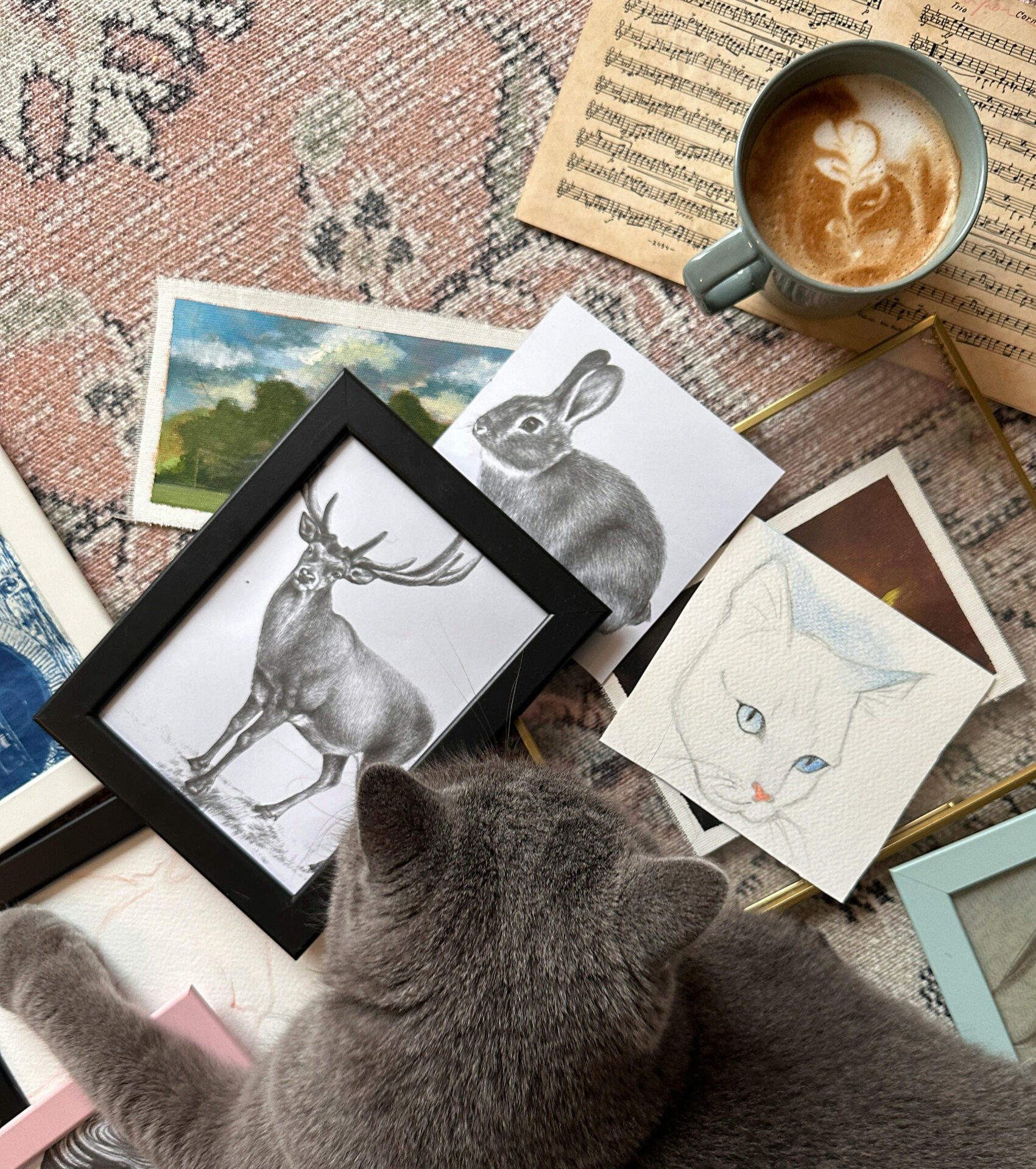
Resolution and color are important when preparing artwork for print, but they are only part of what you eventually see on the wall. The paper itself has a noticeable effect on the finished piece. Its surface, weight, and finish can make an image feel softer, sharper, more painterly, or more photographic.
That difference becomes especially noticeable with textured art prints. A subtle paper grain can interact with light and give an image more physical presence, while a smoother surface keeps attention on fine lines and small details.
With Lumaprints’ fine art paper options, artists and photographers can choose a surface that supports the character of the image. For artwork that needs a finished, ready-to-display presentation, framed fine art prints can also pair detailed paper reproduction with a polished framed look.
What Makes Lumaprints’ Fine Art Paper Different
Lumaprints offers several fine art paper options with different surface qualities and finishes. Each one changes the way an image is presented.
Some available choices include:
- Archival Matte (Smooth Matte) — a bright-white, non-reflective surface suited to artwork where clean detail and a soft presentation are important.
- Textured and Cotton-Based Fine Art Papers — heavier papers with more noticeable surface character, giving prints a traditional fine-art feel.
- Semi-Gloss or Satin-Finish Paper — a smoother surface with a light sheen that can help photographs and colorful digital artwork appear more vibrant.
The difference is not simply something you notice by touch.
Paper texture changes how light falls across the print. It can also affect how sharp edges appear and how strongly certain colors or shadows are perceived. A smooth paper keeps the image looking clean and precise, while a more textured surface can make the print feel closer to a traditional drawing, painting, or handmade piece.
That is why paper selection should be part of the creative decision, not something left until the final step.
Why Texture Matters in a Physical Print
- Texture Can Add Depth Without Changing the Artwork
One of the interesting things about texture in art is that it does not always have to come from paint, brushstrokes, or raised materials.
The paper itself can create that impression.
A gently textured fine art paper catches light differently across its surface. From normal viewing distance, the effect can be subtle, but it can make the print feel less flat and give photographs, illustrations, and digital paintings a more tactile character.
This is particularly useful for artwork that already has painterly qualities, visible brushwork, watercolor effects, charcoal textures, or natural details.
The goal is not to make every print heavily textured. Sometimes the best paper is the one whose surface quietly supports the image.
- Smooth Papers Keep Fine Details Clear
Texture is not always the better choice.
For photographs with very fine details, architectural images, line drawings, or digital illustrations with sharp edges, a smoother paper may provide the cleaner result.
Smooth matte and satin-style surfaces allow small details and tonal transitions to remain easy to see without introducing as much surface variation.
Think about the artwork before choosing the paper.
A soft landscape painting may benefit from visible grain, while a highly detailed black-and-white photograph may look better on a smoother sheet.
- Textured Papers Can Give Artwork a More Traditional Feel
A heavier or more textured paper can change the personality of a digital print.
Watercolor reproductions, sketches, botanical illustrations, landscapes, and traditional artwork often feel more natural on a paper with some visible surface character.
That slight irregularity helps move the piece away from the appearance of a standard poster and closer to something you might expect to see in a fine art portfolio or framed collection.
For artists selling reproductions of original work, this can be especially useful. The paper will not recreate the physical paint or pencil marks of the original, but an appropriate surface can help preserve some of its visual character.
- Paper Weight Matters Too
Texture usually gets most of the attention, but paper weight contributes to the experience as well.
A heavier fine art paper feels more substantial when handled and can give a print a more finished, intentional quality.
This is worth considering if you are creating prints for collectors, exhibitions, portfolios, gifts, or limited-edition releases.
For artwork that will eventually be framed, paper weight and surface should be considered together. A beautiful texture may be appropriate for one image, while another may benefit from a cleaner, smoother presentation.
- Fine Art Paper Turns a Digital File Into a Physical Piece
Most artwork and photography is first viewed on a screen. Printing changes that relationship.
Once the image exists on paper, viewers begin noticing things they may have overlooked digitally: surface, scale, tonal transitions, paper color, and the way the print responds to light throughout the day.
That physical quality is part of what makes textured art prints different from viewing the same image on a phone or monitor.
A screen produces its own light. Paper reflects the light around it. Because of that, the medium becomes part of the experience.
Match the Paper to the Artwork
There is no reason every image in a portfolio needs to use the same paper.
If you are unsure where to start, think about the strongest quality of the artwork.
For photography with sharp details, modern digital artwork, or clean graphic work, a smoother matte or satin-style paper may make sense.
For watercolors, sketches, painterly reproductions, botanical artwork, or images where softness is part of the appeal, a heavier textured paper may feel more appropriate.
If you are creating a series, it is also worth thinking about consistency. Using the same paper across a collection can help several different images feel related when they are displayed together.
When Should You Choose Fine Art Paper Prints?
Fine art paper is worth considering when you want the printed surface to feel like part of the artwork rather than simply something carrying the image.
It can be a good choice when:
- Your artwork contains fine detail or subtle tonal changes.
- You are reproducing drawings, paintings, watercolors, or illustrations.
- You want prints that can be framed, collected, gifted, or sold.
- You prefer a more traditional fine-art presentation over a glossy poster-like appearance.
- You want the option to choose between a smoother finish and a more noticeable paper texture.
- You are producing a series and want a consistent presentation across several pieces.
Before committing an entire collection to one paper, it can also be useful to compare how a representative image looks on different surfaces. What appears best on a monitor is not always what feels best once printed.
Let the Paper Become Part of the Artwork
The best fine art paper does not compete with the image. It supports it.
Sometimes that means choosing a smooth surface so every small detail stays clear. Other times, a little texture gives the artwork the depth and warmth it was missing on screen.
Look closely at the image you are printing. Think about its detail, mood, color, and original medium. Then choose a paper that helps those qualities come through naturally.
Ready to see how the right surface changes your artwork? Explore Lumaprints’ fine art paper print options and choose a paper that gives your photographs, illustrations, or artwork the texture and presentation they deserve.



I love the choices you are giving for our art prints. I have a 24 x 36 acrylic painting that I need a 24 x 36 print. I’m having a difficult time deciding which paper to select. Do you have samples? Or can you help me make a selection? Thank you
Hi Susan,
We’re happy to help. For acrylic paintings, we recommend our papers with texture to mimic similar substrates used in original paintings. These would be Somerset Velvet, Hot Press, and Cold Press. Somerset Velvet would be a great one to start with if you want a textured finish.
If you’re not looking for a textured finish, then our Archival Matte would be the best choice for an acrylic painting!
Either way, if you’re interested in our paper samples, feel free to reach out to our customer support team at [email protected].
Would love to see one print on every different paper you have so we can see the differences. Love your company and your great work. Thank you
Hi Paige! Thanks for your comment! We’ll keep that in mind for future content!