When it comes to decorating interiors, no space is too small. Requiring a sizable area to maximize creativity is a common misconception. Don’t store your photo prints or art prints just yet. They might be what you need to liven up your mini abode.
• Define objective
Our choices depend on who we are. Bedrooms must be serene and relaxing. Living rooms are a bit livelier or, for some, just as tranquil. Subtle? Loud? You decide. Let the room’s purpose guide you to what should be displayed.

• Look outside the box
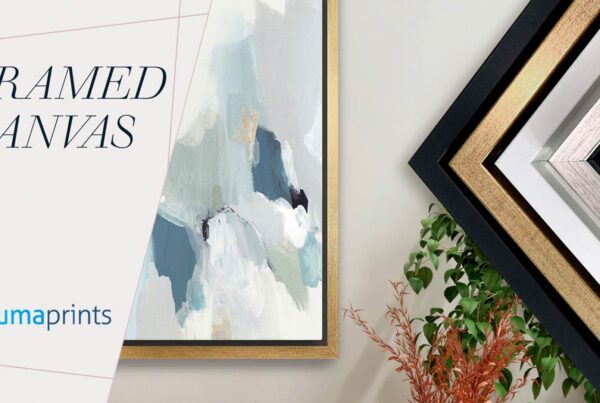
Small pieces are not necessarily the best fit for a tiny area. They can tend to make the room look cluttered. Small prints arranged salon-style on a wall can be wonderful. But a single large piece filling an entire wall can look just as great. Besides, it acts as a focal point and helps prevent crowding. Moreover, invest in prints, framing, and lighting. Various print types are at your disposal: canvas print, metal print, fine art paper print, acrylic print, and more. Combine that with a well-lit area and the results would be amazing.

• Shelves
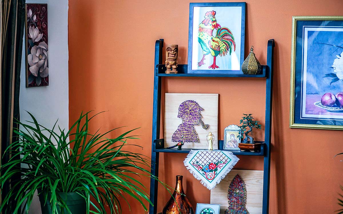
Storage is important, but it doesn’t have to be boring. Prints don’t always have to be on the wall. Any surface can be utilized for display. Place art prints on the shelves alongside books and other items. Put them on top or hang them. Leaning arrangements add depth to the room with no drilling necessary.


• Positioning
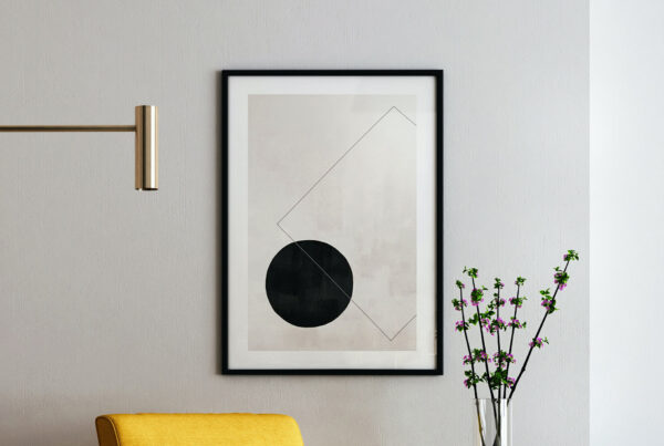
The positioning of the pieces provides more to the room than aesthetics and organization. It allows the space to look bigger, taller, or wider. Vertical print that reaches the ceiling gives the illusion of height. In the same way, a horizontal piece showcases width. Arranging pieces in a similar manner also does the trick.

• Color
Using light colors is a rule of thumb in visually scaling up a room. Then again, there are ways around it. Whatever wall color you choose, make sure that your prints contain colors similar or complimentary to it. If your preferred color is a darker shade, use light prints as contrast. For a lighter shade of wall color, prints within the same color palette provide additional layer; While vibrant prints gives that touch of color.
Careful and calculated choices can create an inviting space with style that goes beyond miniscule size. Wall decorating is all about discoveries. Have fun and don’t be afraid to explore.